Introduction
Developing a human-machine interface (HMI) is a long and complex process that occurs years before deployment. The primary concern is safety, and the HMI has to be transparently usable, ideally as a natural and seamless extension of the body. Cockpit design also must accommodate a seamless integration of mobile devices and services. It must be intuitive, readily discernible (readable), ergonomic, and stress-free. The very word “cockpit” gives us a clue that a great deal of design considerations for the modern automobile interior is derived from aircraft [1]. While displays may not be as complex as that of an airliner they can present issues concerning safety and ease of use, even if some features switched off while driving or are available only when stopped. Many instrument panel designs are emerging, as can be illustrated by accessing You Tube, but how does one develop an HMI properly? We take you through the basic process, emphasizing industry best practices. Bother developers and users can benefit from the discussion that follows in judging whether an HMI is satisfactory.
Optimizing the HMI development process
Designing an HMI follows a series of steps that have been pretty much standardized in the field as best industry practices for developing technology in general. Development is accomplished in these basic steps:
1. Specification – recording user needs and wants
2. Assessing availability of technology and limitations of environment
3. Design
4. Development – construction on the HMI – manufacturing processes, etc.
5. Verification – checking to see if what is developed matches design intent
6. Testing – unit (each gauge), system, functional, user, interoperability, load, stress
7. Validation – determining if HMI does what is intended
8. Documentation
9. Accepting and building on user feedback – iterative design and development
Many of the concepts and considerations for developing graphical user interfaces (GUI) for aircraft, power plants, and computers are transferable to the development of HMIs.
User needs and requirements
Before designing an HMI, one must assess the user’s needs and wants. Above all are safety factors. HMI systems focus on three basic areas: vehicle operation, information, and entertainment. For safety, the system must be reliable, doing what it was intended to do. It must not distract the driver. It should advise the driver how to respond to a safety issue. In terms of operating the vehicle, the HMI must report meaningful and accurate information and allow appropriate and effective responses. Critical systems, such as brakes and steering need to be monitored for wear and functionality. Supporting systems, such as electrical and cooling, need to report their status periodically and more often if there is a possibility of system failure. While not normally in the classification of safety concerns, at times, general information can be vital, such as telling the user of road conditions ahead or events that can affect how accessible a route is. Entertainment functions of an HMI, such as videos, games should not be accessible to the driver but can provide a valuable function in keeping passengers, especially children, preoccupied and not disturbing the driver.
In assessing the availability of technology two considerations must be made: actual availability of the technology and its efficacy. For example, attempting to design a car that anticipates a person’s needs, as in neural network technology may be feasible within a certain margin of error, but not acceptable when 100% assurance is needed in a safety-related situation. Here, one would need a device that responds completely and accurately all the time, and until we have built artificial brains with attendant consciousness, the design goal is not realistic. Neural network technology, however, for entertainment purposes, may be fine.
HMI design – general principles
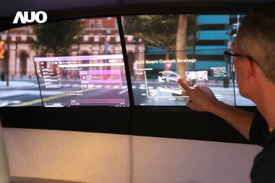
A designer should make sure that the essential features in an HMI are displayed prominently and controls are immediately accessible. Entertainment-related features should be inaccessible to the driver. Displays, themselves may be a head-up type, where the driver does not have to take the eyes off the road but merely look ahead to see the information, usually on the windshield [2]. The user should not have to think about where to look or go through any special physical motions to use the controls. Implementation of different intuitive operational concepts should be foremost. Touch pad technology is a prominent example. It is best to have instrumentation and interactive devices comply with user needs and expectations rather than to have the user adapt to the HMI. A system physically may work quite well functionally but be worthless if it is not user friendly. One option is to have the HMI programmable, or customizable.
Information presentation should be simple and organized according to importance and accessibility. Important information should not be readable at the same time as optional information. Critical information should be always prominent and in one place. Do not present the driver with too much information from which has to be gleaned the important data. Valuable time can be lost with accidents resulting if a driver is taking undue time to parse what s/he needs from the field of everything else. Labeling should be in readily understood terms, and should be pictorial, if possible. There should be no ambiguity in what the display means or how to interact with it. For Westerners the reading pattern is left to right, and although drivers usually have to take tests in the language of the country in which the vehicle is driven, bilingual persons may habitually be searching according to their native scan pattern, such as Orientals, those reading Hebrew, and persons from Arabic-speaking countries. This means that to accommodate both left-to-right and right-to-left scan patterns and the fact that most persons are right-handed, important data should be in the center or upper right. Controls should be in the lower right, as this is the next area to be scanned after the upper right.
Display
As to the actual display itself, these factors should be kept in mind [3]:
1. Where appropriate present information graphically, such as with analogue meters or moving bars, rather than alpha-numerically.
2. Line up numeric values and always show clear labels with units.
3. Use a sans serif font, such as Arial, to minimize detail. To enhance contrast, use both upper and lower case – (as in titles). Use one font if possible.
4. Characters and objects should be viewable readily from normal viewpoints, often eighteen inches to three feet and have good contrast and backlighting. For example, at 500 mm, or 19.5 inches, the type size should be 3.1 mm, or 0.12 inches [4]
5. Use different icons for different digitally presented information.
6. Objects should have a black outline.
7. Related items should be grouped graphically or physically. Critical items should be out front and prominently displayed.
8. Clearly present exactly what happens when a control is actuated. The operator needs to have immediate feedback. If an action is required, make that plain and unambiguous.
9. Do not clutter the environment with detail and colors. Some people literally are color blind. A good idea is to use the same iconization as is used in the universal and international traffic signage.
10. Use standardized alarm colors: red for critical or immediate, yellow for warning, and green for status OK or proceed. The obvious and familiar model is the traffic light.
11. Make the background a muted, pastel or neutral color.
12. Use contrast. Dark images and characters should be against a light background.
13. Color is only an auxiliary way of displaying information. Use icons, words, and positions to enhance the information.
14. It is best to have warnings that are as close to real life as possible. Coolant that is getting too hot, for example, might be displayed by vessel boiling over [5].
Development
A number of materials and production methods exist, but these must follow the design specifications, based on user input, environmental conditions, and available technology. The display cluster and control need to be lightweight but durable, magnesium-based metals and hard plastics being preferable. However, material should be environmentally friendly, either biodegradable or easily recyclable. A major problem with computers has been the ability to dispose of the hardware. Obviously, durability and reliability need to be built in. Software in the manufacturing process, from computer assisted design to manufacture control systems needs to be developed and tested rigorously. HMI displays, as well as the design and manufacturing process rest on a software platform, and the software development process, itself should follow development standards, such with the ISO/IEC 12207 Standard for Information Technology— Software life cycle processes: 12207.0 – 12207.2. All processes from procurement to SW retirement are covered. The Capability Maturity Model Integration (CMMI), as well as the Rational Unified Process, are coupled with the 12207 standard for a well-rounded software life cycle.
Testing, verification, and validation
Testing consumes most of the time in the development process. There is physical testing and user testing. Physical testing may be broken down into categories, such as:
• unit, where each component, such as a gauge or a button, is tested to see if it works
• system, consisting if all the components together physically work
• functional, to see if the system and components do what the designer intended, often called “validation testing”
• interoperability testing to see if the system can work together with other systems and devices (smart or mesh networks)
• user testing to see if the resulting system not only meets needs and expectations but allows for seamless interaction between the user and system. Users from all walks of life, physical characteristics, and cultures should be involved. Testing should be done under many conditions – environmental, psychological, and HMI type. Various conditions under which the vehicle may be in should be replicated. Results should be compared to verification reports, i.e., what the designer intended, and to what user desired and anticipated outcomes are.
Two types of testing are used on the final system: simulations and live (with actual person in real environment). There also is the need to see if the product matches the intent. Verification is determining whether the design matches the requirements. In essence, it is a checklist to see if what was intended in an HMI actually is there. Validation is determining whether the design works as intended, and this accomplished by simulations and actual user testing.
Simulators, such as the fixed base driving simulator (Virtual Vehicle Driving Simulator) are the best way to do initial testing for the same rationale crash test dummies are used in assessing vehicle integrity in accidents [6]. However, t type of simulator can make a difference in testing a car; such as the extent of road view affecting a driver’s reactions [7]. When the HMI test is done in a modeling and simulation environment, the environment must be as close to reality as possible [8].
Documentation
While this section is the smallest, it is, perhaps, the most important. While the HMI should be intuitively obvious how to use, the developer can be so arrogant as to think that this always will be the case. The general rule of thumb for documentation is that the user should be able to do exactly what the writer intended in the documentation. Terminology should be consistent and clear and accompanied by crisp close-up and in-context photographs of the HMI, with each part labeled with the words in the narrative. There should be step-by-step procedures with a description of what happens before, during, and after interactions. As with the HMI, itself, documentation should be user tested to see if anyone not ever having seen the HMI can do exactly what was intended by the designer. A feedback system needs to be in place to give the developers input as to whether the documentation has good quality and whether the HMI, itself, is useful. The HMI, after all, is a type of documentation of what is in the vehicle.
Want to learn more about current technologies and developments in automotive HMI?
Visit our download centre for more articles, whitepapers and interviews: http://bit.ly/cockpit-hmi
References (Subject is indicated by URL – accessed 2 July 2011)
[1] http://www.youtube.com/watch?v=4b0bObGXYSU
[2] http://en.wikipedia.org/wiki/Head-up_display
[3] http://www.windmill.co.uk/interface.html and http://www.hexatec.co.uk/Consultancy/hmi_display_design_guidelines.aspx
[4] http://ergotmc.gtri.gatech.edu/dgt/Design_Guidelines/hndch804.htm
[5] https://docs.google.com/viewer?url=http://www-nrd.nhtsa.dot.gov/pdf/esv/esv20/07-0383-O.pdf&embedded=true&chrome=true
[6] http://papers.sae.org/2003-01-0124/
[7] http://papers.sae.org/2008-01-0562/
[8] http://www.mendeley.com/research/influence-study-design-results-hmi-testing-active-safety/
[9] http://www.youtube.com/watch?v=4b0bObGXYSU
Resources (Subject is indicated by URL – accessed 2 July 2011)
Edzko Smid – Oakland University – Factors to take in consideration in designing an HMI
http://www.automationmag.com/hmi/operator-interface/features/how-to-design-an-effective-hmi-system.html
http://www.automationmag.com/hmi/operator-interface/features/high-performance-hmis-harsher-safety-standards-transform-the-hmi-landscape.html
A Comprehensive HMI Evaluation Process for Automotive Cockpit Design http://papers.sae.org/2003-01-0126
http://www.sciencedirect.com/science/article/pii/S0003687004000158
http://plastics.sabic.eu/news/_en/readyforserie.htm Siemens VDO Presents the Modular Cockpit – Modularized instrument cluster – designed starting with system concept, instead of patching together components.
NVIDIA Instrument cluster – http://www.youtube.com/watch?v=mf-OL2blV-Y&NR=1
http://www.youtube.com/watch?v=7HjfviDYl0Q&NR=1 BMW A computer in your car
A Comprehensive HMI Evaluation Process for Automotive Cockpit Design – http://papers.sae.org/2003-01-0126/
http://papers.sae.org/2002-01-0092/ – “effects an in-vehicle information system might have on driver performance”
http://www.youtube.com/watch?v=8Uar903dz2Y&feature=related example of HMI
https://docs.google.com/viewer?url=http://www.usability.gov/pdfs/chapter18.pdf&embedded=true&chrome=true
http://www.isa.org/InTechTemplate.cfm?Section=Departments4&template=/ContentManagement/ContentDisplay.cfm&ContentID=67070
General HMI resources
http://www.cnn.com/2011/OPINION/06/26/ford.mobility/index.html?hpt=hp_c1
http://www.iqpc.com/Event.aspx?id=329218 http://www.iqpc.com/Event.aspx?id=519420 Research researchers
www.youtube.com/watch?v=4b0bObGXYSU
http://trid.trb.org/view.aspx?id=706294
http://encartrade.com/060_BACKYARD/65_GA/by_ga_video_world_content.jsp?H_V_VIDEOCD=BV201101310000000038
https://docs.google.com/viewer?url=http://www.icas.org/ICAS_ARCHIVE_CD1998-2010/ICAS2008/PAPERS/248.PDF&embedded=true&chrome=true
http://www.icas.org/ICAS_ARCHIVE_CD1998-2010/ICAS2008/PAPERS/248.PDF
http://automotiveiq.wordpress.com/2011/04/18/hmi-the-hi-tech-lifesaver-in-road-accidents/
http://www.asas-tn.org/library/projects/masafas/requirements/D08.pdf/preview_popup/file
http://www.offenes-presseportal.de/auto_verkehr/hmi_green_driving_and_electro-mobility_new_design_and_operation_concepts_for_driver_safety_and_comfort_271171.htm
http://www.crcnetbase.com/doi/abs/10.1201/9781420007497.ch32
About IQPC:
IQPC provides tailored conferences, large events, seminars and internal training programmes for managers around the world. Topics include current information on industry trends, technical developments and regulatory rules and guidelines. IQPC’s conferences are market leading events, highly regarded for their opportunity to exchange knowledge and ideas for professionals from various industries.
IQPC has offices in major cities across six continents including: Berlin, Dubai, London, New York, Sao Paulo, Singapore, Johannesburg, Sydney and Toronto. IQPC leverages a global research base of best practices to produce an unrivaled portfolio of problem-solving conferences. Each year IQPC offers approximately 2,000 worldwide conferences, seminars, and related learning programs.
Visit IQPC for a portfolio of topic-related events, congresses, seminars and conferences: www.iqpc.de


More Stories
The Dangers of Interstate Truck Pileups and What They Mean for Victims
5 Conclusions One Can Make by Analyzing Car Accident Statistics
Why You Should Invest in Regular Car Washes to Protect Your Investment